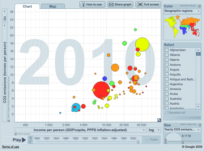
Hans Rosling, world famous Swedish demographer (how many celebrity statisticians are there?) and creator of the Gapminder data visualization tool, offers some thoughts on the importance of timely and transparent reporting of CO2 emissions. If you’re not familiar with his eye-opening presentations already, check out his several TED Talks on YouTube, or explore two centuries worth of CO2 emissions data visually.
Rosling wants all kinds of public data not only to be easily available, but woven into stories that engage the public:
It’s like that basic rule in nutrition: Food that is not eaten has no nutritional value. Data which is not understood has no value.
Continue reading Carbon dioxide data is not on the world’s dashboard