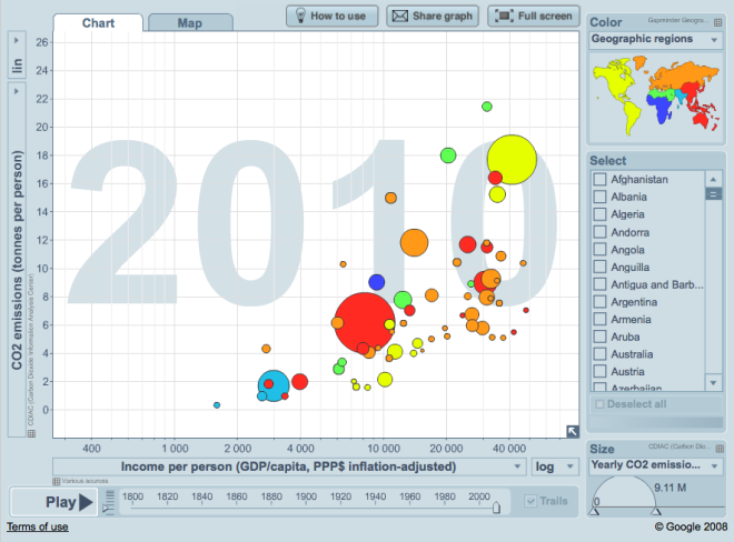
Hans Rosling, world famous Swedish demographer (how many celebrity statisticians are there?) and creator of the Gapminder data visualization tool, offers some thoughts on the importance of timely and transparent reporting of CO2 emissions. If you’re not familiar with his eye-opening presentations already, check out his several TED Talks on YouTube, or explore two centuries worth of CO2 emissions data visually.
Rosling wants all kinds of public data not only to be easily available, but woven into stories that engage the public:
It’s like that basic rule in nutrition: Food that is not eaten has no nutritional value. Data which is not understood has no value.
We all know (whether we want to or not) exactly how this thing called GDP is doing, quarter by quarter, but on greenhouse gas emissions, there’s a year long lag. Rosling’s data liberation tactics have been on occasion somewhat… irreverent:
I was with the Minister of Environment and she was going to Durban. And I said “But you are going to Durban with eleven and a half month constipation. What if all of this shit comes out on stage? That would be embarrassing wouldn’t it?”. Because I knew that she had in 2010 a 10% increase in carbon dioxide emission. But she only published that coming back from Durban. So that became a political issue on TV. And then the government promised to make it earlier. So 2012 we got CO2 data by mid-October, and 2013 we’re going to get it in April.
But as of today, there’s little public pressure for the timely release of the most important indicators related to environmental issues. He laments that greens seem more interested in selecting a few facts that support their preexisting world views than building a comprehensive objective understanding of the world:
But not even climate activists ask for this. Perhaps it is because they are not really governing countries. The right wing politicians need data on economic growth, the left wing need data on unemployment but the greens don’t yet seem to need data in the same way.
And what does he want to do with this all this data, when he finally gets his hands on it? Upgrade the world views of high school and college students all over the world:
We’re going to make teaching materials for high schools and colleges. We will cover the main aspects of global change so that we produce a coherent data-driven worldview, which starts with population, and then covers money, energy, living standards, food, education, health, security, and a few other major aspects of human life. And for each dimension we will pick a few indicators. Instead of doing Gapminder World with the bubbles that can display hundreds of indicators we plan a few small apps where you get a selected few indicators but can drill down. Start with world, world regions, countries, subnational level, sometimes you split male and female, sometimes counties, sometimes you split income groups. And we’re trying to make this in a coherent graphic and color scheme, so that we really can convey an upgraded world view.
The talk that preceded this interview at the Open Knowledge Festival in Helsinki Finland is also viewable online, starting 35 minutes into this archived video stream.